 |
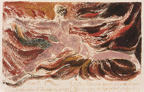
| William Blake, The First Book of Urizen, plate 3. Relief etching, 15.0 x 10.2 cm., 1794, color printed with touches of hand tinting with brush and pen and ink c. 1794. Robert N. Essick collection. Detail of the design. |
Blakes
Method of Color Printing: Some Responses and Further Observations
By Robert N. Essick and Joseph Viscomi
Labour Well the Minute Particulars, attend to the Little-ones[1]
We are pleased that a scholar of Martin Butlins eminence would find our long, technical essay on Blakes color printing of interest. We are also pleased that, in his reply, he does not take exception to any of our basic arguments in favor of one-pull color printing or question their evidentiary basis. Rather, he raises several issues related, if somewhat peripherally, to our topic, continues to favor a two-pull process, and proposes a new method for two-pull printing distinctly different from the methods offered by Michael Phillips in his recent book, William Blake: The Creation of the Songs from Manuscript to Illuminated Printing. We wish to comment on Butlins observations seriatim as they arise in his essay.
Butlin notes that the concentration of our article on technical detail missed out the more general considerations of Blakes overall development in the 1790s and left several important questions unanswered. Our essay indeed concentrated on a single issue raised by Phillips book, Blakes color printing of relief-etched plates. This topic, however, covers more than 600 impressions in ten books and touches on one of the major goals in Blake studies, that of understanding Blakes practice and thinking as an artist. More general considerations of all the techniques Blake deployed in his illuminated books, and the evolution of those books into the large color prints of 1795 and finally into the tempera paintings of the late 1790s, would take a book-length study. We (and we suspect the editors of this journal and most of our readers) found our article long enough as it is. The fact that most of the large color prints are planographic (i.e., printed from the surface), and that the temperas were painted (not printed) on their supports, does not alter the way Blake color printed his relief etchings. We continue to believe that questions about print technology are best answered by looking closely at the primary evidence (in this instance, color-printed impressions of Blakes relief etchings), by conducting experiments in the print studio, and by contextualizing ones findings within the history of color printing in the eighteenth century. Connoisseurship that produces only the most general comments (looks like two pulls to me and my friends), or rounding up the opinions of various scholars and taking a vote, are not as helpful. Technological issues are best resolved by considering technical detail, even if this tends to bore or annoy some of our readers. But since Butlin has raised questions about the color-printed intaglio plates and color-print drawings that followed the color-printed relief etchings, we feel compelled to answer them, which we do later in this response.
Butlins second paragraph forces us to quibble over the meaning of prominent. As we pointed out in our second footnote, several scholars, including Butlin, had indicated a belief in a two-pull process prior to Phillips book. These earlier comments are brief and not even prominent within the essays and books in which they appear. It seemed to us discourteous to critique those who had only mentioned the two-pull process in passing and had not offered any supporting arguments or evidence. The history of the two-pull theory prior to Viscomis 1993 study, Blake and the Idea of the Book, appears to be one of those cultural traditions that many assent to but none investigates. Surely Phillips must be credited with the first, prominent attempt to make a case for the two-pull theory.[2]
We apologize to Martin Butlin for not including his review of Viscomis book in our footnote 2. It was an oversight on our part, not an egregious attempt to slight Butlins great contributions to Blake scholarship. As far as we can discover, that review contains Butlins fullest statement, prior to his present essay, in support of the two-pull theorya paragraph of 206 words. There he refers to the badly registered impression of Nurses Song in the Experience section of Songs of Innocence and of Experience copy E and claims that having made such an error, Blake could easily have succeeded in the not very difficult task of producing a perfect register. As we have made clear in our article, producing a perfect register, one that shows absolutely no signs of the first pull even under magnification, is, impression after impression, an extraordinarily difficult task indeed, even for the eighteenth-century French masters of multiple-plate (and hence multiple-pull) printing and for twentieth-century masters of color printing, such as Stanley Hayter, who says without qualification that it is not possible (see below). Butlins reasoning seems to be that an example of poor registration argues for Blakes easy mastery of perfect registration. The logic here escapes us.
Butlin also notes in his paragraph that Viscomis argument, based on the white lines left where the paper failed to pick up the color at the base of the sharply etched relief lines [see title illus.], could apply irrespective of whether there were one or two printings. This is true but misses the point concerning registration. These fine white lines parallel their relief lines. When they are produced in a second pull, experiments reveal, they will intersect minutely with their relief lines. It is impossible, impression after impression, to so perfectly register the paper to the copperplate that these very narrow white lines remain perfectly parallel. Minute intersecting or touching of white lines and relief inked lines signifies a second pull, but it is a sign consistently absent from Blakes color prints.
According to Butlin, our failure to cite his review, or more generally our approach in footnote 2, is symptomatic of the Inquiry as a whole. He has a point, in that our concern was with an investigation of the primary evidence rather than with recording every word ever published on Blakes color printing method. Perhaps if we had concentrated more on that publication record rather than on Blakes own prints we would have remembered and added Butlins review to his other works we cite. We trust that we have now made up for our original oversight. However, given the nature of our approach to the subject, our failure to cite his review is irrelevant to our case for one-pull color printing.
Butlin expresses discomfort over our restricted definition of Illuminated Printing. We were concerned with establishing what Blake meant by Illuminated Printing in his 1793 Prospectus and not trying to determine how the term should always be used. We are not arguing against the use of the term to include later works with unetched plates printed planographically (The Song of Los, 1795), or those printed from plates etched in intaglio (The Book of Los, The Book of Ahania, both 1795), although Blake did not apply the term to The Gates of Paradise (an intaglio work of 1793) in the Prospectus (E 693). In our contribution to the festschrift for Morton Paley, which we co-authored with Morris Eaves, we claim only that Blake christened his works in the medium [of relief etching] Illuminated Books in Illuminated Printing (220) in the 1793 Prospectus. This does not exclude the possibility of Blake so christening works in other media in some other document, nor does it exclude modern scholars from using the term any way they wish, nor does it restrict the historical and theological resonances of the word illuminated. We fail to see how we have perpetuated a restricted definition. We cant understand how the simple statement that Blake called his relief-etched works Illuminated Books in the 1793 Prospectus shows how quickly a theory becomes an assertion of fact (Butlin).
We find it odd that Butlin believes that Nurses Song in the Experience section of Songs of Innocence and of Experience copy E is not color-printing at all in the usual sense. Phillips believes that this impression is color-printed, and so do we. Otherwise, it would not be the center of so much attention. The disagreement we have with Phillips is whether the colors were applied with the ink in one pull (Essick and Viscomi) or separately in a second pull (Phillips). Apparently Butlin agrees with us about which pull produced the color printingthe first onebut misses our point. He quotes our saying that Yellow ink on top of green color means that the inked text was printed after the color printing in green (97), and from this he concludes that in other words, it is not color printing at all in the usual sense. He appears to have ignored the rest of the passage:
after the color printing in greenthe reverse of the sequence Phillips proposes for all two-pull color printing. On even closer examination, one can see why Blake printed the text after he had printed the colors. He was actually reprinting the text. He had printed the plate à la poupée with ink and colors together, in the style of the other color-printed plates. . . .The colors printed well but the text was exceptionally faint and illegible. . . . Blake attempted to re-ink the text and print or stamp it into place . . . . (97-98)
The registration, however, was poor; the newly printed plate was displaced below its first, exceedingly weak, printing. The ink traces of the texts first printing are clearly visible in illus. 34a and 34b of the print version and 68-70 of the online version of our Inquiry. In other words, the plate was initially printed with ink and colors simultaneously, like all the others; had it been printed well, there would not have been a reprinting of text after colors. But perhaps this is not color printing in the usual sense because for Butlin the only usual method of color printing requires that the colors be applied in a second pull.
It is true that our Inquiry fails to take up Phillips point (103) that small failures of registration in colour-printing can also be seen in other plates in Copy E of the Songs (Butlin). This is the sort of general comment in which the advocates of the two-pull theory specialize. Which plates? Where in each plate? What is the evidence supporting this opinion? Where is the overwhelming evidence (mentioned in his Correction, printed in this issue) that Phillips states exists but does not describe? We looked through Songs of Innocence and of Experience copy E (and other color-printed books and prints) with considerable care and could find no further examples of misregistration or signs of a second printing. We believe we failed in this search because Blake printed all plates, except for Nurses Song in Experience, in one pull. We dealt at some length in our article with various types of foul inking, found in monochrome impressions as well as color-printed ones, that can be mistaken as evidence of misregistration.
Dörrbeckers claim that
some of the full-page designs in The Song of Los were coloured-printed
from almost unetched plates, occasionally in multiple layers of paint
(319) does not, as Butlin states, necessarily imply multiple pulls.
Multiple layers of color-printing medium can be painted on a copperplate
and printed in one pull (see, for example, the ground beneath the figures
in plate 10 of The Marriage of Heaven and Hell copy F [illus. 7]).
The crucial distinction is between colors printed from the plate and those
applied to individual impressions. The two can be differentiated on the
basis of their very different textures (see illus. 2). This is indeed
the case with The Song of Los. We can find nothing in Dörrbecker
that supports a two-pull process or is incompatible with a one-pull process,
yet a consideration of his comments leads Butlin to assert that exact
registration is therefore hardly a consideration when discussing Blakes
usual form of color-printing. . . . Further on in his essay he claims
that precise registration is not in question.[3]
We contend that exact registration is precisely the point, and we suspect
that Phillips would agree, given his statements that multiple plate colour-printing
demanded exact registration (96) and that Blakes method also required
precise registration (97). 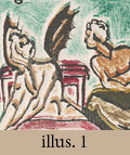 If
the registration were not exact, then evidence for the second pull would
be easily observed throughout Blakes color printing (illus. 1). It is
self-contradictory to claim, on the one hand, that precise registration
is not the issue and tacitly admit, on the other hand, that with one exception
there is no evidence of imprecise registration in Blakes color-printed
relief etchings. The issue is not decided only on the basis of general
muzziness (Butlin), but on specific evidence provided by offset texts
(even if one printing is only a subtle blind embossment of the text),
multiple platemarks, the nonparallelism of white escarpment lines, and
displacements between the image printed in the first pull and the same
image printed in any subsequent pull.[4]
We can find such evidence throughout the vast majority of eighteenth-century,
nineteenth-century, and twentieth-century prints that were printed in
multiple pulls through the press. With the sole exception of the impression
of Nurses Song noted above, we can find no such evidence in Blakes
color prints. Hence, we conclude that he did not print his plates more
than once to create his color prints. We have verified this conclusion
by printing facsimiles and recreations of Blakes relief etchings, intaglio
etchings, and monotypes in the à la poupée method that replicate
Blakes various visual and textural features (see illus. 5a, 6a, 13, 15,
and 18, and in the print version of Inquiry, see illus. 5a-b, 6, 11,
29, 33, 35a-c, and in the online version, illus.18-22, 26, 28, 49, 71-73,
and 76).
If
the registration were not exact, then evidence for the second pull would
be easily observed throughout Blakes color printing (illus. 1). It is
self-contradictory to claim, on the one hand, that precise registration
is not the issue and tacitly admit, on the other hand, that with one exception
there is no evidence of imprecise registration in Blakes color-printed
relief etchings. The issue is not decided only on the basis of general
muzziness (Butlin), but on specific evidence provided by offset texts
(even if one printing is only a subtle blind embossment of the text),
multiple platemarks, the nonparallelism of white escarpment lines, and
displacements between the image printed in the first pull and the same
image printed in any subsequent pull.[4]
We can find such evidence throughout the vast majority of eighteenth-century,
nineteenth-century, and twentieth-century prints that were printed in
multiple pulls through the press. With the sole exception of the impression
of Nurses Song noted above, we can find no such evidence in Blakes
color prints. Hence, we conclude that he did not print his plates more
than once to create his color prints. We have verified this conclusion
by printing facsimiles and recreations of Blakes relief etchings, intaglio
etchings, and monotypes in the à la poupée method that replicate
Blakes various visual and textural features (see illus. 5a, 6a, 13, 15,
and 18, and in the print version of Inquiry, see illus. 5a-b, 6, 11,
29, 33, 35a-c, and in the online version, illus.18-22, 26, 28, 49, 71-73,
and 76).
Butlin next claims that, having forgotten one of Viscomis most important discoveries about edition printing, we cast the two-pull process in its worst light by making it as complex as possible. He accuses us of assuming that Blake would have to wipe the plate clean of ink before adding colors and then wipe colors before adding more ink (Inquiry 80). Again, he appears not to have read the Inquiryor Phillipscarefully. We are merely agreeing with Phillips (95, 101) about what would be the necessary stages of production had Blake printed plates twice, and we are explicit about why Phillips is correct to assume these labor-intensive stages (82). In his Correction, Phillips continues to say that the plate is cleaned of ink and colors per pull. It is the advocates of the two-pull theory who make Blakes processes unnecessarily complex. They fail to perceive that complexity by considering the two-pull process only as a one-off activity that produces a single impression. It is by remembering one of Viscomis most important discoveries that we were led to follow out the consequences of the two-pull process as part of edition printingthat is, a procedure in which multiple impressions were printed from each plate before moving on to the next. When we contextualized the two-pull process proposed by Phillips within edition printing, we were ensnared within a labor-intensive, time-consuming, and materials-wasting series of inking, printing, wiping off the ink, coloring, registering, printing, wiping off the colors to ink the plate again, printing . . . and on and on.[5]
To avoid the complexity of Phillips two-pull method, Butlin advances a new procedure. Instead of coloring the plate immediately after the first pull and printing a second time, Butlin suggests printing all the plates in a series in ink, and later printing the same series of sheets with his [Blakes] thick color medium. This would indeed be a simpler process, but it actually makes registration more difficult. Indeed, it would make impossible anything even approaching acceptable registration. Unfortunately, to back up this observation will require us to descend, once again, into a few technical details.
Neither of the registration methods Phillips continues to advance, in his Correction, would allow for the production process Butlin proposes. If the printed sheet were held under the roller of the press after the first pull in ink, then it could not be removed to allow for another sheet to be printed in ink. Removing the sheet would quite obviously destroy the possibility of keeping it firmly in place. If bottom-sheet registration were used, then the registration for any one plate would be ruined when a second plate was placed on the bed of the press for printing in ink. This is because Blakes plates differ in size and configuration, even within a single illuminated book, and thus each plate would require a new bottom sheet.
We would like to see Butlin test his hypothesis in practice, for we cannot imagine any method of registration that would be compatible with it, but let us suppose there is one. Printing a series of ink impressions first, and then returning to them to print in colors, implies a substantial amount of time between these two activities, particularly if (as Butlin seems to suggest) the ink is allowed to dry. During that interval, the dampened paper would dry. It was standard practice for all professional plate printers in Blakes time to dampen the paper. We can be confident that Blake continued this procedure in his printing from relief-etched plates because of the consistent differences in the size of the plate impressions between examples pulled by Blake himself and the posthumous prints pulled by Frederick Tatham.[6] Lifetime pulls shrank as they dried. Tatham apparently did not dampen his paper and thus there was no shrinkage. If Blake had allowed his inked impressions to dry before a second pull, the image in those impressions would have been smaller than the image on the copperplate. Registration would have been impossible. Wetting the paper again would have been no help, since one cannot control the extent to which a sheet of paper will shrink or stretch under varying degrees of dampness and printing pressure except under scientifically controlled conditions.
We regret that Butlin was confused by our overly abbreviated caption to illus. 16 in the print version of our essay (illus. 36 in the online version). By printed colors painted over inked relief lines we were referring to the way in which the printed colors in the impression of plate 1 from The First Book of Urizen copy D were painted on to the copperplate (not on to the impression) in such a way as to spill over both sides of the relief lines on the copperplate. The point here is that Blake approached the coloring of the plate in a painterly and imprecise way rather than in the exacting manner required of precise registration. We hope that we did not mislead too many readers on this point.
Butlin does not believe
that we can determine, in the case of the title plate to Experience
in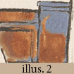 Songs of Innocence and of Experience copy T1, that the
colors over the date were painted on the impression rather than printed
from the copperplate. We think we can, based in part on careful comparison
between the reticulated surfaces created by color printing and the much
smoother surfaces when the same medium is painted on the impressions (see
illus. 19 and 20 in the print version of our essay; 42 and 46a in the
online version).[7] Faint traces of the
date can be seen through the gray color, the texture and covering power
of which are not difficult to duplicate. The recreation of the Experience
title plate in illus. 2 was printed in a Van Dyke brown intaglio ink with
burnt sienna opaque watercolor and was hand colored in a gray made of
Chinese white (zinc white) and Paynes gray. The printed color (lower
right, below the date), though painted on the plate smoothly with a brush,
has the reticulated texture characteristic of colors pulling away from
one support to another; the color upper right, covering the date, was
applied directly to the impression with a similar brush and mixes flat
with the texture of the paper.
Songs of Innocence and of Experience copy T1, that the
colors over the date were painted on the impression rather than printed
from the copperplate. We think we can, based in part on careful comparison
between the reticulated surfaces created by color printing and the much
smoother surfaces when the same medium is painted on the impressions (see
illus. 19 and 20 in the print version of our essay; 42 and 46a in the
online version).[7] Faint traces of the
date can be seen through the gray color, the texture and covering power
of which are not difficult to duplicate. The recreation of the Experience
title plate in illus. 2 was printed in a Van Dyke brown intaglio ink with
burnt sienna opaque watercolor and was hand colored in a gray made of
Chinese white (zinc white) and Paynes gray. The printed color (lower
right, below the date), though painted on the plate smoothly with a brush,
has the reticulated texture characteristic of colors pulling away from
one support to another; the color upper right, covering the date, was
applied directly to the impression with a similar brush and mixes flat
with the texture of the paper.
But our argument concerning the Experience title page in copy T1 also rests on the patterns of color printing observable in Blakes other impressions (in Songs copies F and G) of the plate pulled in the same printing session. Patterns are repeated in sequentially pulled color prints because the colors, after that first impression, remain on the plate; these colors in turn guide the hand coloring of the plate. If they were wiped off between pulls, as Phillips claims, then Blake was not only wasting colors and preventing color build upwhich allowed him to add less color in subsequent printingsbut was also repainting his plate in imitation of his previously pulled impression. In the Experience title plate impressions, these patterns are all the same in the areas that were color printed, except that none of the other impressions has the date covered. In all these sequential impressions, Blake has avoided printing colors over the date, hooking them around the beginning of the date instead. It is far more likely that Blake painted out the date directly on the copy T1 impression than that he interrupted his printing process to color the area of the date on the copperplate in a new color for a single impression. It is also unlikely that he could print a pigment that ignored the physical laws of surface tension to reticulate less than all the others in the same impression. Further, the gray pigment covering the date in the T1 impression is the same as that used to paint over the white-line escarpments that remain uncovered in the other impressions produced in the same session.
 And
finally, and most convincingly, there is the physical character of the
plate itself that would make covering the date by printing colors over
itin one or two pullsextremely difficult and extremely obvious had it
been done. Illus. 3 shows the structure of the plate, its surface areas
and shallows. Note that ink does not print at the base of the relief lines
or spaces between letters and lines, and this includes the lines forming
the numbers of the date. The pattern around the date resembles that in
the impressions of the Experience title plate in Songs of Innocence
and of Experience copies T1, F, and G (Inquiry illus.
20 and 21 in the print
And
finally, and most convincingly, there is the physical character of the
plate itself that would make covering the date by printing colors over
itin one or two pullsextremely difficult and extremely obvious had it
been done. Illus. 3 shows the structure of the plate, its surface areas
and shallows. Note that ink does not print at the base of the relief lines
or spaces between letters and lines, and this includes the lines forming
the numbers of the date. The pattern around the date resembles that in
the impressions of the Experience title plate in Songs of Innocence
and of Experience copies T1, F, and G (Inquiry illus.
20 and 21 in the print 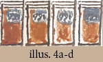 version;
46a and 46b in the online version). Had the color hiding the date actually
been printed, there would be fine white lines around and between the numbers.
Unless Blake had previously built up colors in that area and/or printed
with undue pressure or with very thick colors (both of which would cause
splotching and filling up of lines), the escarpments around these relief
lines would be present whether the plate was color printed in one pull
(illus. 4a) or two pulls (illus. 4b), or if the second pull had been
printed with less pressure (illus. 4c), as Phillips claims (Correction),
or with more pressure (illus. 4d).[8] Knowing
the structure of his plate and the character of his printing technique,
Blake also knew there was no point in blotting out the date as part of
his printing procedure when it could be covered up more effectively during
hand finishingas were the escarpments around the lines forming the pillars.
version;
46a and 46b in the online version). Had the color hiding the date actually
been printed, there would be fine white lines around and between the numbers.
Unless Blake had previously built up colors in that area and/or printed
with undue pressure or with very thick colors (both of which would cause
splotching and filling up of lines), the escarpments around these relief
lines would be present whether the plate was color printed in one pull
(illus. 4a) or two pulls (illus. 4b), or if the second pull had been
printed with less pressure (illus. 4c), as Phillips claims (Correction),
or with more pressure (illus. 4d).[8] Knowing
the structure of his plate and the character of his printing technique,
Blake also knew there was no point in blotting out the date as part of
his printing procedure when it could be covered up more effectively during
hand finishingas were the escarpments around the lines forming the pillars.
Phillips
implies that the inked date hidden under opaque color is evidence that
the colors were applied separately. Otherwise, he concludes, the ink would
lie on top of colors as it 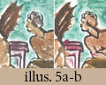 presses
into the paper. Butlin is explicit about this supposed sandwich effect.
He states that he is convinced by our argument (his footnote 4) that a
denser medium or a darker color will always appear to be lying on top
of a thinner medium or a lighter color, as we demonstrated in our discussion
of Nurses Song, but he continues to believe that ink lines would appear
to be lying on top of the
presses
into the paper. Butlin is explicit about this supposed sandwich effect.
He states that he is convinced by our argument (his footnote 4) that a
denser medium or a darker color will always appear to be lying on top
of a thinner medium or a lighter color, as we demonstrated in our discussion
of Nurses Song, but he continues to believe that ink lines would appear
to be lying on top of the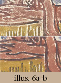 denser colored areas in a one-pull process. Because we do not see this
visual effect in Blakes color prints, he reasons that Blake printed the
colors in a second, separate pull through the press. But this is faulty
reasoning. We do not see it in one-pull printing because the colors are
applied over the ink and are thus mixed wet on wet with it. The result
is that the colors often dominate the ink. Intermixing of colors and ink
increases for the subsequent impressions, because the dabber reinks over
the colors and the colors are then reapplied over that ink. The color-printed
relief etching based on The Marriage of Heaven and Hell plate 10
(illus. 5) demonstrates this intermixing. The plate was printed in
denser colored areas in a one-pull process. Because we do not see this
visual effect in Blakes color prints, he reasons that Blake printed the
colors in a second, separate pull through the press. But this is faulty
reasoning. We do not see it in one-pull printing because the colors are
applied over the ink and are thus mixed wet on wet with it. The result
is that the colors often dominate the ink. Intermixing of colors and ink
increases for the subsequent impressions, because the dabber reinks over
the colors and the colors are then reapplied over that ink. The color-printed
relief etching based on The Marriage of Heaven and Hell plate 10
(illus. 5) demonstrates this intermixing. The plate was printed in 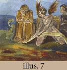 black
ink and various water-based colors simultaneously; the colors painted
over the ink on the wings and body of the devil intermix with the ink
and remain clearly on top (illus. 5a). Printing this plate in two pulls,
however, first in ink and then in colors, minimizes intermixing, the result
of which is a cleaner looking ink or outline (illus. 5b). This is true
whether the ink is intaglio or relief, whether printed on a press or by
hand. We see the same contrast between relief etchings based on the Experience
title plate color printed in one and two pulls (illus. 6a and 6b). This
intermixing effect is seen throughout Blakes color prints (illus. 7;
see also in the print version of Inquiry illus. 9, 12, 16, 36, and in
the online version, illus. 25, 29, 36, 74, 75). By painting over some
inked lines and leaving others uncolored (painting within the lines, as
it were), Blake could continue to vary the tonality and textures of his
color prints.
black
ink and various water-based colors simultaneously; the colors painted
over the ink on the wings and body of the devil intermix with the ink
and remain clearly on top (illus. 5a). Printing this plate in two pulls,
however, first in ink and then in colors, minimizes intermixing, the result
of which is a cleaner looking ink or outline (illus. 5b). This is true
whether the ink is intaglio or relief, whether printed on a press or by
hand. We see the same contrast between relief etchings based on the Experience
title plate color printed in one and two pulls (illus. 6a and 6b). This
intermixing effect is seen throughout Blakes color prints (illus. 7;
see also in the print version of Inquiry illus. 9, 12, 16, 36, and in
the online version, illus. 25, 29, 36, 74, 75). By painting over some
inked lines and leaving others uncolored (painting within the lines, as
it were), Blake could continue to vary the tonality and textures of his
color prints.
At issue is the covering power of the colors. They have the most when applied thickly as an opaque film on the impression, as illus. 2 demonstrates. They cover less completely when intermixed with ink, as in one-pull printing (illus. 5a and 6a). And they cover least when printed separately in a second pull (illus. 5b and 6b). A cleaner or sharper outline is comparable to Butlins ink lines lying on top of the denser colored areas. In other words, what Butlin says should happen with one-pull printing actually happens with two pulls. The facts that the intermixing of colors and ink is present throughout Blakes color printsand that sharper ink lines showing through colors is notare further evidence for one-pull and against two-pull printing.
Butlin is also misled
by the illusion created by thin washes applied on top of printed colors.
Thin, water-based colors are absorbed by unprinted areas of the paper.
At the same time, because of their different viscosities, water-based
colors tend to run off of oil-based ink or thick color-printing medium.
Thus, washes will appear to be under a dense medium printed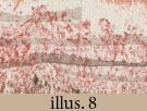 prior to the application of the washes. This is, pace Butlin, a provable
fact, and can be demonstrated without resorting to the miracles of modern
technology. Illus. 8 shows three horizontal gray wash lines of various
thickness that appear to lie under thick, reticulated colors (burnt sienna
and raw umber) printed from a plate onto damp paper, but all three horizontal
lines were applied with a brush over the colors once they were
dry. This illusion is probably the reason why Richard Lloyd, head of
the print department at Christies London, observed that in one place
a layer of watercolor has been added over the printing ink but under the
color-printed pigments (Butlin) on an impression of The Book of Urizen
plate 3 sold by Christies London on 18 December 2001. Note the lack of
specifics. Which place on the print? What color is the wash? Is it thinner
than the printed colors? We have carefully inspected the Urizen
print in question (see title illus.). The thin grayish washes that outline
the arms and legs do indeed appear under the printed colors, but all were
applied on top of them.[9]
prior to the application of the washes. This is, pace Butlin, a provable
fact, and can be demonstrated without resorting to the miracles of modern
technology. Illus. 8 shows three horizontal gray wash lines of various
thickness that appear to lie under thick, reticulated colors (burnt sienna
and raw umber) printed from a plate onto damp paper, but all three horizontal
lines were applied with a brush over the colors once they were
dry. This illusion is probably the reason why Richard Lloyd, head of
the print department at Christies London, observed that in one place
a layer of watercolor has been added over the printing ink but under the
color-printed pigments (Butlin) on an impression of The Book of Urizen
plate 3 sold by Christies London on 18 December 2001. Note the lack of
specifics. Which place on the print? What color is the wash? Is it thinner
than the printed colors? We have carefully inspected the Urizen
print in question (see title illus.). The thin grayish washes that outline
the arms and legs do indeed appear under the printed colors, but all were
applied on top of them.[9]
One need not know how
washes and colors interact or resort to facsimile reproduction to realize
how absurd the idea is that the watercolor washes on the Urizen
print were applied before the colors were printed. One need only
think through the production process to see how unworkable it is to apply
colors by hand prior to finishing all stages of the printing procedure.
The text is lightly printed in a light orange-yellow ochre ink. We have
searched diligently, 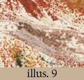 but
we can find at most only a few very small spots of this ink in the design
area. The figure and flames, the relief lines of which guided the coloring
on the copperplate, are defined primarily by the colors in which they
were printed (burnt sienna, raw umber, red, beige, and yellow-ochre pigments)
rather than the ink. Thus, if Blake had added washes to the design area
before he color printed it, he would be painting on what was virtually
a blank piece of paper. How did he determine where to place the finishing
washes before there was any image on the paper to finish? The purple-gray
wash surrounding the figures left
but
we can find at most only a few very small spots of this ink in the design
area. The figure and flames, the relief lines of which guided the coloring
on the copperplate, are defined primarily by the colors in which they
were printed (burnt sienna, raw umber, red, beige, and yellow-ochre pigments)
rather than the ink. Thus, if Blake had added washes to the design area
before he color printed it, he would be painting on what was virtually
a blank piece of paper. How did he determine where to place the finishing
washes before there was any image on the paper to finish? The purple-gray
wash surrounding the figures left 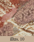 forearm
is clearly an attempt to fill in areas of the arm where the color printing
is weak or did not print at all (illus. 9). How would Blake know that
he needed to improve this area before the color printing had been executed
and its incompleteness on the arm made evident? The black ink line, almost
certainly added with a pen, that outlines the upper edge of the figures
right leg carefully follows the edge of the color printing (illus. 10).
There is no underlying orange-yellow ochre ink printed in this area. How
would Blake know where this fine pen and ink line should be drawn prior
to color printing? Adding handwork to a print is always the last step,
after all printing has been finished. To reverse this procedure and add
an intervening layer of handwork between printing operations creates unnecessary
problems, particularly when there is little if any image printed on the
paper. All such difficulties and complexities are avoided if, as we are
convinced, Blake printed the inked text and the color-printed image in
one pull through the press and later added the washes and pen and ink
outlining. The fact that this was the conventional sequence in Blakes
time does not persuade us that Blake did not follow it.[10]
forearm
is clearly an attempt to fill in areas of the arm where the color printing
is weak or did not print at all (illus. 9). How would Blake know that
he needed to improve this area before the color printing had been executed
and its incompleteness on the arm made evident? The black ink line, almost
certainly added with a pen, that outlines the upper edge of the figures
right leg carefully follows the edge of the color printing (illus. 10).
There is no underlying orange-yellow ochre ink printed in this area. How
would Blake know where this fine pen and ink line should be drawn prior
to color printing? Adding handwork to a print is always the last step,
after all printing has been finished. To reverse this procedure and add
an intervening layer of handwork between printing operations creates unnecessary
problems, particularly when there is little if any image printed on the
paper. All such difficulties and complexities are avoided if, as we are
convinced, Blake printed the inked text and the color-printed image in
one pull through the press and later added the washes and pen and ink
outlining. The fact that this was the conventional sequence in Blakes
time does not persuade us that Blake did not follow it.[10]
Butlin faults us for not discussing the intaglio illuminated books, the independent color-prints (i.e., the intaglio and relief etchings color printed as part of the Large Book of Designs), and the large color prints. He suggests that all these provide strong evidence for two-pull printing of all of Blakes color prints. We disagree and take the opportunity to examine them now.
Why Blake switched in 1795 to intaglio printing for the last two illuminated books of the 1790s is a good question, but the idea that the switch was intended to make it easier to print by the two-pull process (Butlin) is not the answer. If that was Blakes intention, why do The Book of Los and The Book of Ahania exist in one copy each? Why only eight color printscounting proofsamong the 17 extant impressions of the two works? How does this compare to over 600 color-printed relief etchings? From this minority report, Butlin reasons that, if two pulls here, then two pulls in everything leading up to it. Such logic should give one pause, given how experimental Blake was as a painter and printmaker, often engaging in methods that are unique to a single work (as Butlin notes in his comments about America a Prophecy of 1793). In this matter, however, Blake was as consistent as Butlin supposes. But this consistency resides in his continued use of one-pull printing.
 We
have argued that Blake color printed his relief-etched plates by inking
the raised surfaces with a dabber and applying colors locally with brushes
and small dabbers to the inked surfaces and uninked shallows in the standard
à la poupée manner and then printing raised surfaces and shallows
simultaneously.
We
have argued that Blake color printed his relief-etched plates by inking
the raised surfaces with a dabber and applying colors locally with brushes
and small dabbers to the inked surfaces and uninked shallows in the standard
à la poupée manner and then printing raised surfaces and shallows
simultaneously.  Printing
the two levels of an intaglio plate simultaneously is a variation on this
technique. Essick once suspected otherwise, because he interpreted the
colors extending beyond the platemark in The Book of Los title
plate (illus. 11) as signs of a second printing (Printmaker 130).
What he now realizes is that these colors were printed from the beveled
edges of the copperplate (illus. 12a, b). Because an intaglio plate requires
more pressure than surface printing, it was (and still is) common practice
to bevel the plate to remove sharp edges and thereby prevent them from
possibly tearing the paper.
Printing
the two levels of an intaglio plate simultaneously is a variation on this
technique. Essick once suspected otherwise, because he interpreted the
colors extending beyond the platemark in The Book of Los title
plate (illus. 11) as signs of a second printing (Printmaker 130).
What he now realizes is that these colors were printed from the beveled
edges of the copperplate (illus. 12a, b). Because an intaglio plate requires
more pressure than surface printing, it was (and still is) common practice
to bevel the plate to remove sharp edges and thereby prevent them from
possibly tearing the paper. Illus. 12c shows the bevel that Blake gave to his Book of Job plate 2.
It is very easy to replicate the visual effect of colors spreading past
the platemark in The Book of Los
Illus. 12c shows the bevel that Blake gave to his Book of Job plate 2.
It is very easy to replicate the visual effect of colors spreading past
the platemark in The Book of Los in
fact, if the colors are applied near the edge of the plate, it is very
difficult to prevent such spreading. Viscomi printed his replica of The
Book of Los title plate simultaneously in intaglio with an oil-based
black ink and in relief with water-based colors (illus. 13). It is one
of 21 impressions he printed on 16 July 2002 in the University of North
Carolina print studio in a two-hour period. A detail of the left margin
of the impression in illus. 13 and one of the right margin of another
impression show the colors extending past the platemark and even past
the bevel (illus. 14a-b). Viscomi also color printed etched replicas of
the bottom corner of The Book of Los plate 5 (illus. 15) and of
The Marriage of Heaven and Hell plate 10 (illus. 16) simultaneously
in intaglio and relief. The latter impression, with intaglio text and
color-printed vignette,
in
fact, if the colors are applied near the edge of the plate, it is very
difficult to prevent such spreading. Viscomi printed his replica of The
Book of Los title plate simultaneously in intaglio with an oil-based
black ink and in relief with water-based colors (illus. 13). It is one
of 21 impressions he printed on 16 July 2002 in the University of North
Carolina print studio in a two-hour period. A detail of the left margin
of the impression in illus. 13 and one of the right margin of another
impression show the colors extending past the platemark and even past
the bevel (illus. 14a-b). Viscomi also color printed etched replicas of
the bottom corner of The Book of Los plate 5 (illus. 15) and of
The Marriage of Heaven and Hell plate 10 (illus. 16) simultaneously
in intaglio and relief. The latter impression, with intaglio text and
color-printed vignette, is analogous to The Book of Los plate 5
 and The Book of Ahania plate 6. Blakes illustrations in The
Book of Los plates 2 and 5 appear to have been rudimentarily etched
and lightly printed with the colors; the illustration in the Marriage
replica plate was inked but the ink did not print through the colors.
With intaglio plates, printing the inked lines of the illustration is
actually unnecessary since the etched lines themselves direct where one
applies the colors to the copperplate. Blake appears to have used the
etched lines of Albion rose, The Accusers of Theft Adultery
Murder, and Lucifer and the Pope in Hell only as guidelines
for coloring, since they appear to have no printed outlines in color-printed
impressions. Their outlines were added to the impressions with pen and
ink.
and The Book of Ahania plate 6. Blakes illustrations in The
Book of Los plates 2 and 5 appear to have been rudimentarily etched
and lightly printed with the colors; the illustration in the Marriage
replica plate was inked but the ink did not print through the colors.
With intaglio plates, printing the inked lines of the illustration is
actually unnecessary since the etched lines themselves direct where one
applies the colors to the copperplate. Blake appears to have used the
etched lines of Albion rose, The Accusers of Theft Adultery
Murder, and Lucifer and the Pope in Hell only as guidelines
for coloring, since they appear to have no printed outlines in color-printed
impressions. Their outlines were added to the impressions with pen and
ink.
We do not expect our images to substitute for a thousand words. Thus, it is worth reviewing the contributions to what we know about color printing made by the twentieth-century printmaker Stanley Hayter and others at Atelier 17 in Paris and New York:
Experiments combining surface and intaglio methods of printing were made at Atelier 17 as early as 1930. The earliest color prints at Atelier 17 were made by applying color with a roller to the surface of an uninked intaglio plate, from which an impression was made on paper. The plate was then cleaned and inked for intaglio, and overprinted on the same paper. Because this method presented the problem of registering the two impressions exactly, the two steps were combined in a single printing by first inking for intaglio and then adding a surface color by means of a roller. (Moser 35)
Variations on this simultaneous relief and intaglio printing technique, which Hayter referred to as simultaneous color printing, included the direct wiping of certain areas with an ink soaked rag, or poupee, which allowed the artist to use a variety of colors on a single plate, as well as the use of stencils, silk screens, inks of different viscosities, and rollers of varying hardness to control the placement of the relief colors (Moser 35-36; see also Hayter, New Ways of Gravure 158).[11] However the colors were applied to the surface of the plate,
the application of colours . . . was less important than the big idea of combining all colours on one plate and printing it in one passage through the press. Efficiency was not the only reason for adopting this process; it gave imaginative artists an entirely different notion of working in colour intaglio. New textural possibilities, new aesthetic means of expression lay open. In the past, traditional colour aquatint had appeared sporadically; after Hayters breakthrough, . . . intaglio printing in colour began to burgeon and is now common practice. (Black and Moorhead 16)
Simultaneous color printing was born out of the attempt to avoid all the difficulties of register, which Hayter knew all too well (New Ways 159). In About Prints, he describes various methods for registering plates, including pinholes, bottom sheets, and pinching the paper with the presss roller, and concludes that it is worthy to note that none of these methods is absolutely precise (58). Phillips continues to suggest that Blake might have used the roller to hold his paper in place, despite our pointing out that the sheets used in Songs of Innocence and of Experience are too short for this method, given the circumference of the roller of his press (Inquiry 95), and he suggests a variation on the method in which the paper is held in place by a weight. Of the pinched sheet method (and this would be true of its variant), Hayter states: If done carefully it is accurate to within 1/32 inch even on large plates, but it is only applicable when printing wet on wet (New Ways 136). This means that the paper must be printed damp and sequentially, and thus cannot be set aside as Butlin has suggested, and that the best alignment one can hope for might fall below the threshold of vision but will be detected by close scrutiny and magnification.[12] Our facsimile in Inquiry is this good, but when examined under a magnifying glass it reveals the characteristic ghosting of a second pull (see illus. 6 and 7a in the print version; 20 and 21 online). Moreover, plates that pass through the press twice look the part: . . . it must be obvious that the full, sharp relief can only be seen from the last plate printed, that of all other plates having been flattened by subsequent passes through the press. And, as we noted in Inquiry, registering one plate on top of another is typical of the practice of a skilled artisan rather than a process by which the original thought of the artist becomes visible directly in a print (Hayter, About Prints 58-59).
It may come as a surprise to Butlin, as it did to Essick, that Hayter believed that simultaneous printing in intaglio and surface colors
to the layman . . . will seem so obvious that he will be surprised to hear that it was not carried out successfully long before, as the advantages of producing a full colour proof in a single operation, rather than having to recommence the whole operation three or four times, are obvious enough. Of course it had been tried before, and what happened to the printer attempting it was probably what happened to us many times during the fourteen years we spent developing this method. (About Prints 59-60)
His method as finally
or fully developed could be very complicated, involving multiple intaglio
techniques on a large plate (e.g., engraving, soft-ground, aquatint) and
multiple roll ups in relief inks of different viscosities (see note 11).
But Hayter, who was among the first to admit that the fewest and simplest
operations should be used to achieve the desired effect (Moser 40), identified
the fundamental technical problem as surface colour shifting under the
rolling pressure of the press, [which] once clearly understood, was solved
by controlling the surface tension of the [relief] ink (About Prints
61).  For
Blake, who used water-based colors instead of relief inks, this meant
making colors that could be applied thickly or thinly to shallows or surfaces
and which transferred to damp paper without prominent splotching or smearing.
As illus. 17 demonstrates, modifying the composition of the colors can
affect their surface tension and viscosity. Too much or too little pigment,
glue, ox gall, honey, whiting, or water in the color makes for different
visual qualities in the print, as do the type and texture of the paper,
the amount of size in it, and the amount of pressure used in printing.[13]
Painting quickly and keeping the colors moist works well, but so does
painting the plates and letting them dry (which is inevitable for larger
works), because when printed onto damp paper under pressure the dried
water-based colors are reconstituted and will transfer to the paper. The
color-printed replicas reproduced here are of this second kind.
For
Blake, who used water-based colors instead of relief inks, this meant
making colors that could be applied thickly or thinly to shallows or surfaces
and which transferred to damp paper without prominent splotching or smearing.
As illus. 17 demonstrates, modifying the composition of the colors can
affect their surface tension and viscosity. Too much or too little pigment,
glue, ox gall, honey, whiting, or water in the color makes for different
visual qualities in the print, as do the type and texture of the paper,
the amount of size in it, and the amount of pressure used in printing.[13]
Painting quickly and keeping the colors moist works well, but so does
painting the plates and letting them dry (which is inevitable for larger
works), because when printed onto damp paper under pressure the dried
water-based colors are reconstituted and will transfer to the paper. The
color-printed replicas reproduced here are of this second kind.
We agree that the large color-print drawings (1795) and the Books of Designs (1796) represent a culmination of Blakes color-printing experiments. But it is not as Butlin imagines. He sees Blakes development as moving from simple to complex, from small relief etchings printed in one pull, to etchings and relief etchings printed in two pulls, to large color prints produced in two pulls and elaborately finished in watercolors and pen and ink.[14] The development, however, was towards greater simplicity, from printing a combination of oil-based ink and water-based colors from two levels of one plate to the planographic printing of just water-based colors from the surface of a support. Technically, the color-printed Albion rose is the vignette from The Book of Los title plate writ large: the unprinted intaglio line was used as a guide for painting the surface of the plate in colors that were printed onto damp paper and finished in watercolors and pen and ink. The large color-print drawings are, technically, Albion rose writ large, in that the colors were painted on a flat support. The outline of the design was probably drawn on a gessoed millboard (though copper was used for at least one design) in India ink, which would adhere permanently to the support and not transfer to the paper.[15] The composition was painted in colors using brushes and dabbers and printed onto damp paper and finished in watercolors and pen and ink. The outline and composition, the latter in thin layers of dried colors on the support after printing, could be returned to years later and the process repeated.[16]
 The
color-print drawings are monoprints, in that the impressions pulled from
the painted surface are not exactly repeatable. The monoprints reproduced
here were executed in the method described above.
The
color-print drawings are monoprints, in that the impressions pulled from
the painted surface are not exactly repeatable. The monoprints reproduced
here were executed in the method described above.  Illus.
18 is a recreation of Albion rose before finishing, printed without
outlines in one pull in undiluted watercolors from the surface of a sheet
of 1/16 inch plexiglass in place of an intaglio plate. Illus. 19 is a
color print of a still life printed in watercolors from a 3/32 inch gessoed
board (illus. 20) with India ink outline, which did not print. If dark
outlines are wanted with the colors, they need only be applied with them,
over the India ink outline, as another monoprint from a different gessoed
board
Illus.
18 is a recreation of Albion rose before finishing, printed without
outlines in one pull in undiluted watercolors from the surface of a sheet
of 1/16 inch plexiglass in place of an intaglio plate. Illus. 19 is a
color print of a still life printed in watercolors from a 3/32 inch gessoed
board (illus. 20) with India ink outline, which did not print. If dark
outlines are wanted with the colors, they need only be applied with them,
over the India ink outline, as another monoprint from a different gessoed
board  demonstrates
(illus. 21). Blake appears to have used the method more for its
demonstrates
(illus. 21). Blake appears to have used the method more for its textural possibilities (illus. 21) than its reproductive potential. However,
he could print two or three impressions from a well-painted plate or board
before having to replenish colors. Such subsequent impressions are called
maculatures, which are usually lighter and less intense than the first
impression (illus. 22 and 23). Increasing pressure for the subsequent
prints helps to secure a good impression but is not absolutely necessary
(it was not done for the maculatures here, but was done for a third still
life impression). Many of the color-printed illuminated plates (relief
etchings and intaglio etchings) have maculatures (see Inquiry illus.
12, 13 in the print version; 29-32 online).
textural possibilities (illus. 21) than its reproductive potential. However,
he could print two or three impressions from a well-painted plate or board
before having to replenish colors. Such subsequent impressions are called
maculatures, which are usually lighter and less intense than the first
impression (illus. 22 and 23). Increasing pressure for the subsequent
prints helps to secure a good impression but is not absolutely necessary
(it was not done for the maculatures here, but was done for a third still
life impression). Many of the color-printed illuminated plates (relief
etchings and intaglio etchings) have maculatures (see Inquiry illus.
12, 13 in the print version; 29-32 online).
In William Blake,
Butlin claims correctly that Blake did not repaint his plate before taking
each  impression.
In at least some cases Blake seems to have printed two or even three copies
of a print without renewing his application of paint to the plate, each
impression being therefore weakened in intensity (83).
impression.
In at least some cases Blake seems to have printed two or even three copies
of a print without renewing his application of paint to the plate, each
impression being therefore weakened in intensity (83).  He
does not, however, explain how the second impression is compatible with
two-pull printing, nor does he or Phillips appear to realize that maculatures
undermine the entire hypothesis of two-pull printing. Neither addresses
the issue of maculatures directly and thus they appear to assume that
the maculatures of relief and intaglio etchings and, for Butlin, of the
large color prints were also printed in two pulls, one for the outline
and then for the colors. But this could not be, since the colors and outlines
of the maculatures are diminished because they come from the plate just
printed; they show, in other words, that there was printable color left
on the plate or board from the first pull (even if replenished in some
areas). Thus, the relief or intaglio etching or board was not cleaned
of all colors in order to print the outline only. Rather, it was printed
again, without intervening steps, to produce a second impression. This
second impression, from the same plate, is necessarily one pull. Why then
would Blake go through all the trouble of registration when a good impression
could be produced from the plate in one pull? That second impression again
demonstrates the efficacy of one-pull printing.
He
does not, however, explain how the second impression is compatible with
two-pull printing, nor does he or Phillips appear to realize that maculatures
undermine the entire hypothesis of two-pull printing. Neither addresses
the issue of maculatures directly and thus they appear to assume that
the maculatures of relief and intaglio etchings and, for Butlin, of the
large color prints were also printed in two pulls, one for the outline
and then for the colors. But this could not be, since the colors and outlines
of the maculatures are diminished because they come from the plate just
printed; they show, in other words, that there was printable color left
on the plate or board from the first pull (even if replenished in some
areas). Thus, the relief or intaglio etching or board was not cleaned
of all colors in order to print the outline only. Rather, it was printed
again, without intervening steps, to produce a second impression. This
second impression, from the same plate, is necessarily one pull. Why then
would Blake go through all the trouble of registration when a good impression
could be produced from the plate in one pull? That second impression again
demonstrates the efficacy of one-pull printing.
The core question in this discussion about color printing is not whether relief or intaglio plates could be registered (of course they canthough certainly not with just one pinhole), but whether they could be registered consistently without ever showing any traces of that registration. We have argued that traces of the second pull are always present if one knows how and where to look, and have argued from much practice in the printing of both intaglio and relief-etched plates, from the close examination of Blakes prints, and from the practice of many other printmakers. We have also argued and demonstrated that both intaglio and relief-etched plates can be printed from both their surfaces and incised lines and shallows simultaneously, and that water-based colors can be used with oil-based inks. Blake pioneered these printing and etching techniques as well as the monoprint and the modern concept of the color print as an aesthetic work equal to painting. A question we asked in Inquiry is worth repeating: why do in an intricate and expensive way (two-pull printing) what can be done directly and more simply and less expensively (one-pull printing)? As Hayter and other printmakers knew, there is no aesthetic gain from printing the plates twice. Butlin and Phillips do not claim that Blake could not do what he did in one pull or that two pulls made for better images. They merely keep asserting, without solid evidence and without refuting our counter-evidence, that Blake consistently used two-pull printing.
Butlins concluding paragraph returns to the theme with which he began. We have indulged in too much technical detail, focused over-much on the primary evidence, and this has blinded us to larger issues. Only general knowledge, painted with a broad brush, is allowed. We find this approach unsatisfactory for the study of printing technology. Surveys of Blakes artistic development must neither ignore nor contradict material facts. Indeed, one can speculate on the meaning and aesthetic qualities of an art work, but to ascertain its medium, whether the colors are oil or water based, the support paper or canvas, the plate an engraving or a mezzotint, the print pulled once or twice through a press, it is the material facts, discerned by chemical analysis, x-rays, magnification, hands-on experiments, computer enhancement, and other research aids, that will prove most objective and helpful. Avoiding Minute Particulars will not lead to the Palace of Wisdom.
Works Cited
Bentley, G. E., Jr. Blake Books. Oxford: Clarendon P, 1977. Plate numbers and copy designations for Blakes illuminated books follow Bentley.
Black, Peter, and Desiree Moorhead. The Prints of Stanley William Hayter. London: Phaidon, 1992.
Blake, William. The Complete Poetry and Prose. Newly Revised Edition, ed. David V. Erdman. New York: Doubleday, 1988. Cited as E followed by page number.
Butlin, Martin. The Paintings and Drawings of William Blake. 2 vols. New Haven and London: Yale UP, 1981.
Butlin. The Physicality of William Blake: The Large Color Prints of 1795. Huntington Library Quarterly 52 (1989): 1-17.
Butlin. Review of Viscomi, Blake and the Idea of the Book. Burlington Magazine 137 no. 1103 (Feb. 1995): 123.
Butlin. William Blake 1757-1827. Tate Gallery Collections vol. 5. London: Tate Gallery, 1990.
Dörrbecker, D.W. Commentary in William Blake, The Continental Prophecies. Blakes Illuminated Books vol. 4, General Editor David Bindman. London: William Blake Trust/Tate Gallery, 1995.
Eaves, Morris, and Robert N. Essick and Joseph Viscomi. The William Blake Archive: The Medium when the Millennium is the Message, in Romanticism and Millenarianism, ed. Tim Fulford. New York and Basingstoke: Palgrave, 2002. 219-33.
Essick, Robert N. William Blake, Printmaker. Princeton: Princeton UP, 1980.
Essick, and Joseph Viscomi. An Inquiry into William Blakes Method of Color Printing. Blake/An Illustrated Quarterly 35 (2002): 74-103. Online version available at http://www.blakequarterly.org
Gilchrist, Alexander. Life of William Blake. 2 vols. London and Cambridge: Macmillan, 1863.
Hamlyn, Robin, and Michael Phillips. William Blake. Exhibition catalogue, Tate Britain, London. London: Tate Publishing, 2000; New York: Harry N. Abrams, 2001 (with a supplement on the Metropolitan Museum version of the exhibition).
Hayter, Stanley William. About Prints. Oxford: Oxford UP, 1962.
Hayter. New Ways of Gravure. New York: Pantheon Books, 1949.
Mayer, Ralph. The Artists Handbook of Materials and Techniques. Third edition. New York: Viking, 1977.
Moser, Joann. Atelier 17: 50th Anniversary Retrospective Exhibition. Madison, Wisconsin: Elvehjem Art Center, 1977.
Phillips, Michael. William Blake: The Creation of the Songs from Manuscript to Illuminated Printing. London: British Library, 2000. Distributed in the US by Princeton UP.
Rossetti, William Michael. Rossetti Papers. London: Sands & Co., 1903.
Viscomi, Joseph. Blake and the Idea of the Book. Princeton: Princeton UP, 1993.